Previous: The early days
While Dropbox has an established voice, if we were playing around with time travel, we needed a consistent way to talk about it. As the team started to iterate on the design and copy, I realized that there were different directions we could go with the tone.
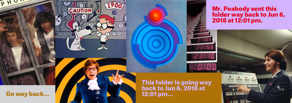
Ever used a mood board? They’re basically a collection of images, colors, and styles that are designed to evoke a certain feeling. They’re great for visual design applications—like when designing the look and feel of a new product.
In this case we used them to align at a high level on the right tone.
Mood 1: Go way back
This mood feels like: A whimsical trip through time
Mood 2: Return to
This mood feels like: Going back to before stuff went wrong

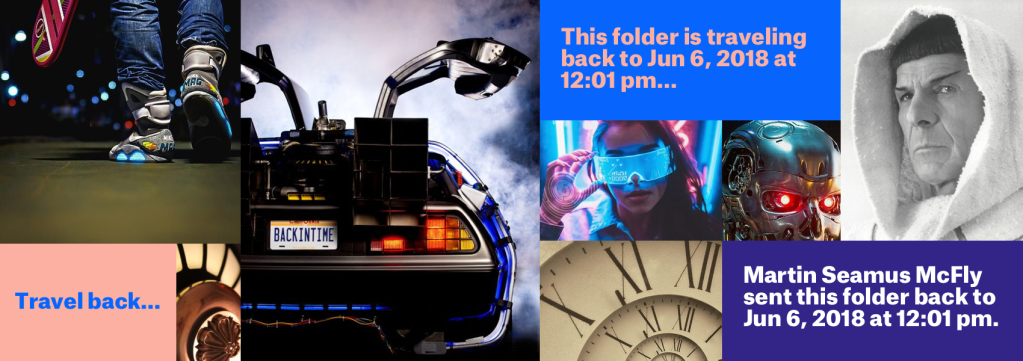
Mood 3: Travel back
This mood feels like: Using advanced technology to go back to a better time
We ultimately settled on Mood 2: Going back to before stuff went wrong. This mood allowed us to really focus on holding the user’s hand and getting stuff back to normal.
